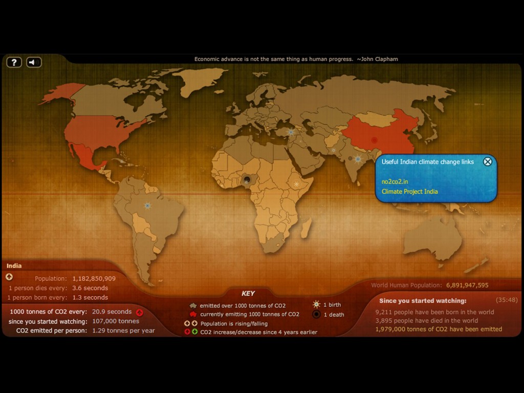
Climate Change, environmental degradation and quality of life are very closely related to population growth and land use intensities being imposed on different parts of the earth. Understanding the tilt of the balance is perhaps key to solving the issues. However, its not very easy to develop such an understanding and advanced visualisation techniques are very helpful in this regard. I found this very cool , yet simple, website called Breathing Earth that presents an interactive simulation map of CO2 , birth rates and death rates for countries in the world. The map requires a few extra moments to sink in but its very powerful to realise that those extra moments meant something in terms of the number of deaths and births.Grasping the continuous , rapid births and deaths on earth is certainly disillusioning in some ways. Click the question mark button on the top left of the map to understand how to use the simulation. Hope it doesn’t leave you feeling strange…
http://www.breathingearth.net/
HT

